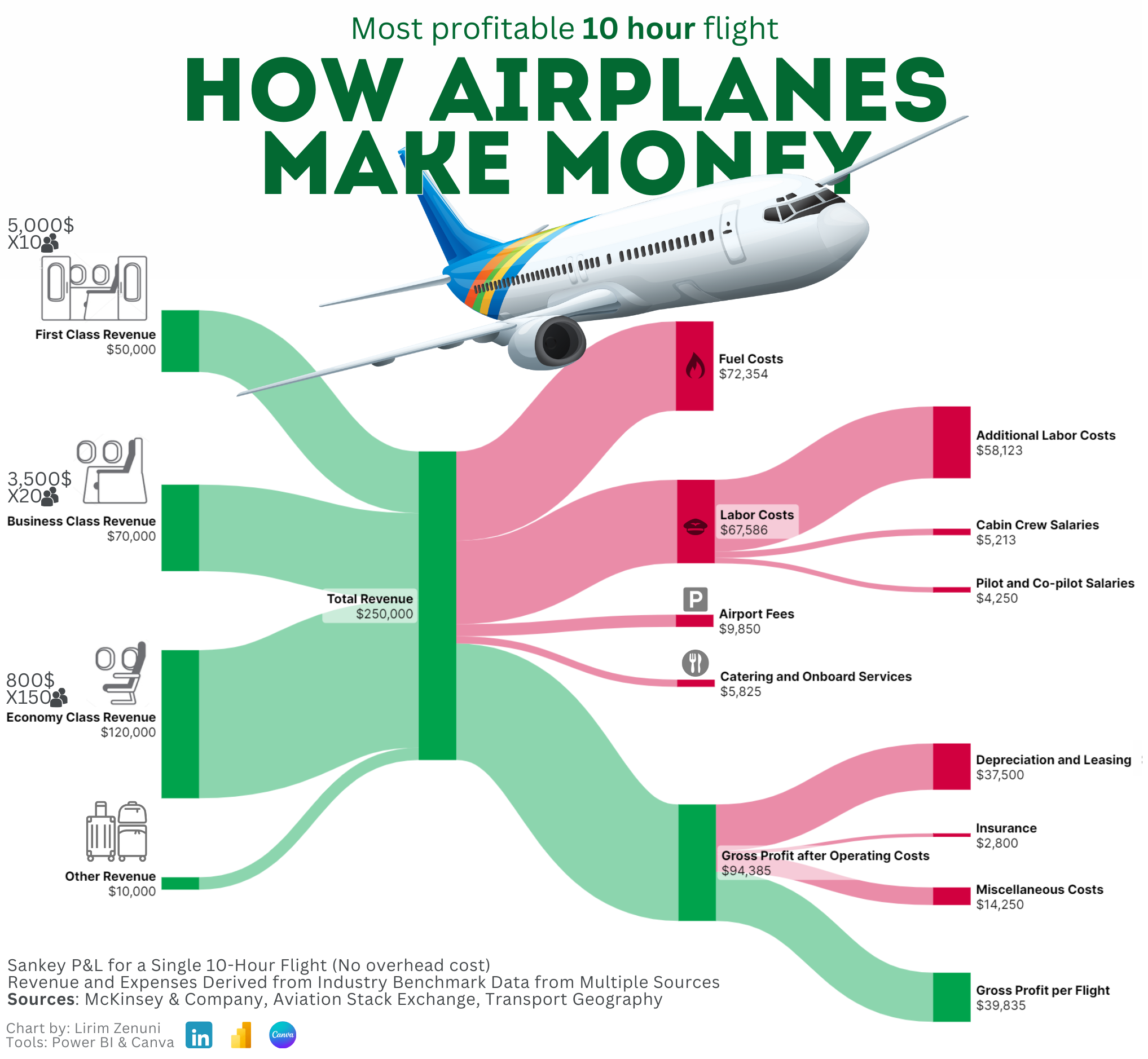
Were they gifted this plane making the flight or am I just not understanding where price of the plane itself is being paid. Is that the depreciation bit?
If a citation is going to point to any of the Stack Exchange Q&A pages, it is extremely important to specifically cite the exact post or answer, since -- not dissimilar to Wikipedia -- the quality, consistency, and biases of Stack Exchange answers is paramount for evaluating the information presented, especially factual data to be fed into an infographic.
I personally am intrigued at these $800 economy, ten-hour flights, as well as a total omission of freight cargo in the underbelly. As presented, this flight has 180 passengers and runs for ten hours. This would suggest it's not a common narrow-body, either the Boeing 737 or an Airbus A320, as even their largest available configurations can't fit 180 people in a 2 class setup, let alone a 3 class setup. It could possibly be the Airbus A321, though.
My point is that if it's a widebody aircraft or the A321, not hauling cargo would be some staggering malfeasance for a commercial revenue airliner. But I can't follow-up on any of these queries, since the sources aren't properly cited.
This doesn’t add up when you realise economy is treated like shit and first class gets the royal treatment. The seats aren’t worth it, what’s the reason for keeping them and why hasn’t shrinkflation hit this market?
Because 2 of those seats bring in more revenue than 6 of the economy seats, but you'd never fill a plane of only first-class seats at that price point and the benefits compared to the cheaper seats make them more desirable for those who can afford them.
As for shrinkflation, maybe it started earlier with airlines when they started nickel-and-diming people for everything and cutting out in-flight meals and the like. It's crazy to see how the luggage fees and such effectively increased their gross profits by about 33%.
For reference, check out this recent clip going into detail about how some airlines aren’t making any profit and are being floated by agreements with credit card companies.
It's basically two adjacent pie charts. I don't hate these, but I agree they are a bit confusing because it implies a relationship between sections in the left and right that are across from each other. They're useful to get a sense of proportion in each categorization.
I think the intent of the big green bar in the middle is to signify that all the revenue streams combine to form this single total revenue, then the various cost centers chip away at it until you get the singular green revenue total in the bottom left.
I guess it’s how our brains are wired like another poster said, because I definitely didn’t pick up an implied relationship between the revenue and costs here.