lugal , 24 days ago And from the side: |
And from the side:
|
42yeah , 24 days ago | | | | | | | | i | | | l | | | | | | | | | | | | | |
| | | | | | | | i | | | l | | | | | | | | | | | | | |
Alexstarfire , 23 days ago Where is j?
Where is j?
bjoern_tantau , 23 days ago And the other side. ZYXWVUTƧЯϘᕋOИM⅃ꓘႱIHӘᖷƎꓷƆꓭA
And the other side.
ZYXWVUTƧЯϘᕋOИM⅃ꓘႱIHӘᖷƎꓷƆꓭA
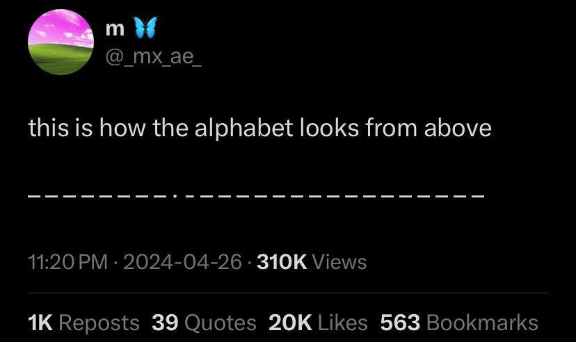
ChaoticNeutralCzech , 24 days ago Better version: The alphabet from the front and above: ABCDEFGHIJKLMNOPQRSTUVWXYZ ––––‒‒––·‒–‒— –––––‒–––—––‒ This corresponds almost perfectly with Roboto on my Android phone. Characters featured: U+00B7 · MIDDLE DOT (I) U+2012 ‒ FIGURE DASH (EFJLSZ) U+2013 – EN DASH (ABCDGHKNOPQRTUVXY) U+2014 — EM DASH (MW) U+200A HAIR SPACE (put in the middle cuz M&W are too wide for any dash)
Better version:
The alphabet from the front and above: ABCDEFGHIJKLMNOPQRSTUVWXYZ ––––‒‒––·‒–‒— –––––‒–––—––‒
This corresponds almost perfectly with Roboto on my Android phone. Characters featured:
U+00B7
U+2012
U+2013
U+2014
U+200A
porous_grey_matter , 23 days ago This was my first thought, thanks for doing it. It drives me mad that the em dash isn't the width of the M!
This was my first thought, thanks for doing it.
It drives me mad that the em dash isn't the width of the M!
ChaoticNeutralCzech , 24 days ago The Pixar lamp choosing where to strike:
The Pixar lamp choosing where to strike:
EtherWhack , 24 days ago The only defense are serifs
The only defense are serifs
ChaoticNeutralCzech , 24 days ago They might have helped but we've seen how it fared regardless
They might have helped but we've seen how it fared regardless
manucode , 24 days ago M and W should be wider than the rest, shouldn't they?
M and W should be wider than the rest, shouldn't they?
teft , 24 days ago Maybe it’s a monospaced font
Maybe it’s a monospaced font
Fetus , 24 days ago The i says otherwise.
The i says otherwise.
kamiheku , 24 days ago That's not how monospaced fonts work
That's not how monospaced fonts work
midnight , 24 days ago Then the "i" would likely be a dash too 𝚒𝙸
Then the "i" would likely be a dash too
𝚒𝙸
Pretzilla , 24 days ago Not if it's allegorical Nor if they are all the same letter or same size letters
Not if it's allegorical
Nor if they are all the same letter or same size letters
manucode , 24 days ago I and J are already different
I and J are already different
sushibowl , 24 days ago em dash to the rescue! —
em dash to the rescue! —
moosetwin , 24 days ago I feel like I've seen this post on lemmy like 50 times over the last few days
I feel like I've seen this post on lemmy like 50 times over the last few days
The_Picard_Maneuver OP , 24 days ago Ah, damn. Somehow I must have missed it.
Ah, damn. Somehow I must have missed it.
otter , 24 days ago First time I'm seeing it!
First time I'm seeing it!

