SeaOtter ,

Interesting data, but I don’t think it is beautifully presented. Bar charts, or maybe a blown up pie charts may be easier to grasp the scale.

Blobs of the largely same color, dispersed in a random pattern make it hard to quickly see scale

BlackRose OP ,

The beautiful presentation was chosen to underline a message.

ianis ,

which would have been a lot more clear in a bar chart

BlackRose OP ,

It's like yesterdays post https://lemmy.ml/post/2352771 with a map of the US. The circle could represent earth.

conductor ,

This one wasn’t very good either.

blackbrook ,

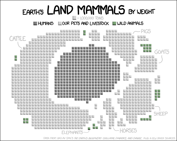
This is good, but presenting the blobs as such different shapes makes it harder to get a sense of relative size. (Obviously some of the differences are huge enough it doesn't matter, but comparing humans and cattle say.)

And which blob is chickens? I guess chickens are so much smaller and lighter than other domestic animals they don't show very big here.

BlackRose OP ,
  • All
  • Subscribed
  • Moderated
  • Favorites
  • random
  • dataisbeautiful@lemmy.ml
  • test
  • worldmews
  • mews
  • All magazines